

Among fashion brand’s visual elements one of the most significant is a logo. It can give character, quality, style and direction to a collection even before customers actually see them. If you are starting a streetwear brand, luxury fashion brand, eco-friendly clothing brand or accessories company, then selecting the right logo style will help create a brandable logo. Fashion is very visual in nature so your logo must perform well in printed marketing materials, ads, social media profiles, websites, packaging and clothing labels. The logo style carefully selected can help create a consistent and professional appearance of your brand in addition to helping your customers remember it. The trick is to pick a design that will appeal to your target audience and will be still useful as you expand your company.
Understand Your Fashion Brand Identity
The style of your logo should be based on your target audience. Various approaches to the visual are effective for different groups. Bold typography, experimental layouts or contemporary symbols may be the ones that a young fashion consumer will appreciate. For those who are looking for high quality clothing, they might be more attracted to more subtle typography and classy details. The aim is not to design a logo which would be liked by all. Rather than that, it ought to effectively connect with people who are most likely to connect with your fashion products.
Make the choice whether to use a text based logo
The design is logos without pictures; it is through typography that the recognition is created. This method can be particularly effective for fashion labels as it is common for names to be prominently featured on clothing labels, storefronts, websites and other fashion items. When you are mulling around in your mind the various typography concepts, a text logo maker can help you experiment with layout and visual directions, until you find a concept that you like. But, the final design must always be judged on the basis of your brand, readability and practicality.
Discuss various ways of creating logos
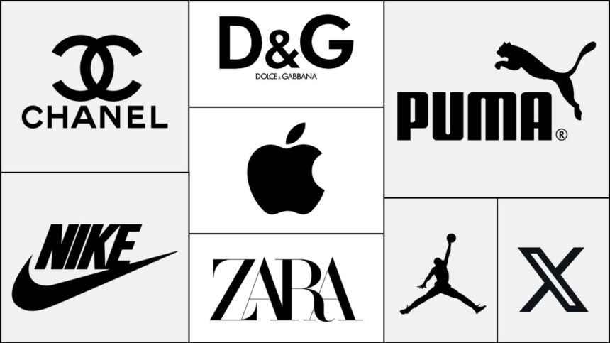
There are a number of styles of logo you can employ for your fashion brand. Knowing which of the options is strong will help in the decision making process. A wordmark is the primary element of identity with a brand name being the word. This lends itself well to the business with a memorable name. This is helpful when you have a long brand or fashion name or wish to have a short identity for the brand. A symbol/ icon logo is an icon that symbolizes the company. A unique symbol can be a powerful one when customers start to link your products with the symbol. Combination marks is a combination of typography and an icon. This gives flexibility as sometimes elements can be used together and sometimes individually. An emblem is a text and image that is encased in a form. While this style can give the impression of a traditional style, care should be taken in the design so that it is not too difficult to produce in smaller sizes.
Choose Typography Carefully
Fashion branding is a big affair, which is vastly affected by typography. The right typography can create a modern, classic, playful, minimalist or luxurious logo. Serif fonts have a more refined or classic look, and can be appropriate for some high-end fashion enterprises. Sans serif fonts are more likely to be clean and modern looking. Script fonts can be used to lend a personality, but could prove to be hard to read if used too many times. Don’t use fonts because they will look nice if you use them on their own. The font should be suitable to use with your company name and be readable in various applications. The typography should also be taken into account on clothing tags, embroidered products, packaging, websites as well as mobile screens.

Choose Colours that Reinforce your Brand
Color is an even influencing factor that can go to the customer’s mind about a fashion brand. Black and white colors usually convey a broad range of significances (black is for simplicity, versatility; white purity) while metallic colors are perceived as a sign of premium positioning. Bright colors mean youthful and energetic; muted colors showcase a softer preference or natural look. Do not pick a color or two only because it is in style when making your series of colors. Think about how they’ll represent your brand with an ever-evolving collection. It is also important that your logo is effective in a single colour. It is essential because some applications, like embroidery, stamps, packaging, invoices or some printing techniques will not be able to handle complicated color combinations.
Consider the line of work in which you can use your fashion sense
Fashion logos are hardly ever utilized in one area. Ever seen on the labels of your clothes, hangtags, shopping bags, websites, social media posts, product photography images advertisements packing (the insides in addition to the outsides) and even stores? Well, it needs to be flexible also so that’s crucial. This means that a two-by-five foot website banner logo isn’t going to be legible when it’s the size of a quarter on a clothing tag. Considering the design at different scales. Details become difficult to see when reduced and complex layouts can become hard to replicate. Any fashion logo should be recognisable when seen on a large sign, as well as small label.
Take care of balancing the originality and simplicity of the balance
The key to a fashion brand is to strike a balance between creativity and simplicity. An overly simple logo can be easily forgotten or an overly complicated logo can be hard to recognize. See if there are any unique features that will set your brand apart from the rest, but not overload it. This can be one of the custom letterforms, special spacing, a simple symbol, or an expertly chosen color scheme. The simplest designs frequently use fairly basic visual designs, but include one or two memorable features.
Every student will receive a sheet of blank paper
Learning about other brands will give you an insight into the visual environment of your brand. Examine logos of businesses that offer a similar product or service to similar customer base and find similarities. Note that some categories have a specific font, color or symbol that they often employ. This research can enable you to discover ways in which you can differentiate your brand. Competitor research is for knowledge, however, don’t copy them. You should have a logo that has its own appearance. If it is too similar to other fashion companies, people may not know which brand to trust.If it’s too close to another fashion company, there could be confusion and this would diminish your brand recognition.
Test Your Logo in Real Situations
Test your logo in the places where your customers will view it before you finalize your logo. Add the design to a clothing label, product page, social media page, packaging mock-up and business card. Test to see if the logo is legible at small dimensions, and if it’s fine when enlarged. The background should also be tested, as should be light and dark backgrounds. Get a few people to give you their input. Get them to say “do you like the design” but instead, ask them what the logo means. They will give you an indication if the visual identity is in line with the personality you are going for or not.
Consider Future Growth when buying any product
Your range of fashion products could diversify to new products or a range of markets or even a new collection. The logo may be restrictive later if it is only applicable to one type of product. Then, for example, a clothing manufacturer can introduce shoes or other accessories, perfume or home goods. A logo design flexible enough to let you do this without pulling a rebranding stunt. Consider your business and its future for a few years, and select an identity that has the potential to change with it.
Don’t fall for all of the design trends
Logos can evolve as fashion does and there’s a trend for them. The use of minimalism, gradients, experimental typography, vintage styles, and more could be in vogue for a while. Lots of trends aren’t bad but when you simply use them without thinking, later on your logo may appear dated.. You can introduce a modern touch, but never at the expense of the core identity of that brand.
Develop a Visual Identity that is consistent
Your logo will just be a part of your fashion brand’s visual style. After you select a style, then stick with it throughout your marketing.The personality of a brand should reflect in its all over typography, colour palette, photography, packaging/website design/social media graphics/promotional matter. If your brand is consistent from platform to platform, it will be easier for consumers to recognize. Showing your logo to your customers over and over can create a familiar icon which is associated with you, your products, and the experience they have with you.
Final Thoughts
Choosing a cool font, or great looking logo design is only half the battle of designing your perfect fashion brand logo, it also needs to be the appropriate style of logo; Think about your brand personality, target audience, abstraction types and color, typographic choices along with the function of your logo and competitors you will be competing against in the alternative work area. The ideal logo is one that will make it recognizable, but not so complicated that it is hard to reproduce on a variety of media. Trying out various ideas can help you find out which one you’re able to get the most resonance from. A text logo maker may come in handy if brands are still in the experimental phase when using typography based concepts. However, the most crucial is to make sure the final logo will be in line with the nature of your fashion company and will act as an anchor to your overall look. Your logo is more than just a logo when it evokes the values of your brand and your customers. It becomes an important element of your fashion brand that you tell.